Configuring Matrix Charts
Overview
Matrix Charts provide a structured way to display data across two dimensions, helping you analyze patterns and relationships effectively. This visualization enables users to analyze patterns, spot correlations, and compare data points in a compact, organized layout.
Getting Started
Before configuring a Matrix Chart, ensure you have:
- Access to the dataset you want to analyze
- Two categorical fields for the X-axis and Y-axis
- A clear objective for your analysis
Business Value
- Reveals trends and patterns across multiple dimensions
- Simplifies analysis of large datasets
- Supports data-driven decision-making
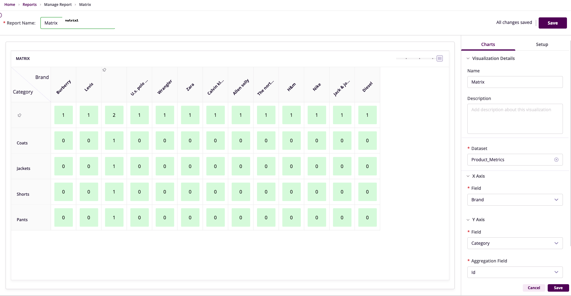
Chart Configuration
Basic Configuration
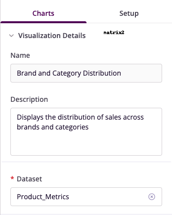
- Name: Provide a descriptive title
- Description: Explain the chart's purpose
- Dataset: Select the relevant dataset
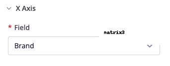
X-Axis Configuration
- Field: Choose column for matrix columns
- Unique Values: Each value becomes a column
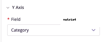
Y-Axis Configuration
- Field: Select column for matrix rows
- Unique Values: Each value becomes a row
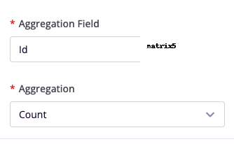
Aggregation Settings
- Aggregation Field: Choose numerical column
- Aggregation Method: Select summary type
Advanced Features
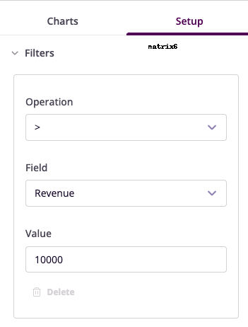
Filters
Configure data filters to refine your visualization:
- Operation: Select conditional operator
- Field: Choose column to filter
- Value: Set filter criteria
Example Use Cases
Product Performance Analysis
- X-Axis: Region
- Y-Axis: Product Name
- Aggregation: Sales Revenue (Sum)
- Insight: Regional product performance comparison
Employee Performance Evaluation
- X-Axis: Department
- Y-Axis: Employee Name
- Aggregation: Performance Score (Average)
- Insight: Departmental performance assessment